Here is a comprehensive list of all of the modules that are available in the Impressa Theme. Below, you can choose a particular module to learn more about!
Button

The Button Module is a module that takes all of the styling from the buttons themes settings. Customizable content is limited to the following.
Content:
- Text in the button,
- The alignment of the button – only applies to breakpoints with width larger than 767px (unless you turn off mobile center setting)
- Link for the button.
- Turn off the styling that puts the button in the center of the section at mobile breakpoints.
Styling:
- Button Color
- Text Color
It is recommended that you keep the inherited colors in most situations. However, if you want to create a button that needs to differentiate from the majority, feel free to change the button and text color. Just make sure that it follows proper contrast ratios.
Cards
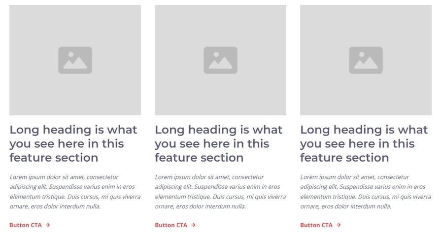
The cards module is a module that holds a max of four cards. Cards are used to display information that should essentially point the user to other content, like a content offer, landing page, blog post, etc. Hence why there is a button CTA instead of a normal button. All aspects can be applied or removed based on preference. Customizable content is limited to the following.
Content –
- Cards – Can be removed or added. Max 4, Minimum 1.
- Click +Add to add a new card.
- To delete, hover over a card, and click the Delete Icon ![]()
- To edit the content of a card, hover over the card and click the Edit Icon ![]()
- Image that can be removed or replaced. Allows for addition of alt text, changing size to be automatically adjusted (recommended) or exact height/width, and image loading settings.
- Rich Text
- CTA that can be replaced or removed to link to the proper content location.
Styles –
- Card
- Background of each individual card can be a color, an gradient, or an image.
- Border can be applied with a style, color, and width
- Corner applies a curve to the corners of the card
- Spacing can add a margin above, and below the card. Padding can be applied to the card itself.
Copyright
The copyright module is the module used to apply the proper copyright information in the footer of the website. Included is a menu that allows to link to the privacy policies, terms of service, and cookie settings pages. Privacy Policy and Terms of Service is recommended to be added to any website. However, Cookie Settings is not required unless you are required by law to apply it. Customizable content is limited to the following.
Content –
- Rich text can be changed so that the wording regarding the copyright text fits requirements. It is highly recommended to keep the 2026 because this automatically changes the text to the current year.
- Menu can be changed so that you can edit or remove links in the menu.
Style –
NO CHANGES CAN BE APPLIED TO STYLING.
Curve Columns 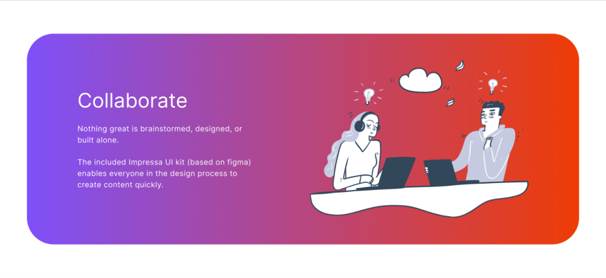
The curve columns module is a module that holds two columns in a container with a gradient background. Customizable content is limited to the following.
Content –
- Rich text
- Column text is a rich text field that can be changed with any headings, links, etc.
- Text color changes the color of all text of the module
- Image that can be removed or replaced. Allows for addition of alt text, changing size to be automatically adjusted (recommended) or exact height/width.
Style –
- Gradient allows you to change the colors and direction of the gradient background.
Custom Bullets – List

The custom bullet module is a module that lets you replace the normal bullet point with an image. Customizable content is limited to the following.
Content –
- Image used for the bullets and can be removed or replaced. Allows for addition of alt text, changing size to be automatically adjusted (recommended) or exact height/width.
- Rich text
- Column text is a rich text field that can be changed with any headings, links, etc.
- Bullet size allows you to change the size of your bullet, with 15px being the minimum and 25px being the maximum.
- Bullet - Top/Bottom Position allows you to change the position of the bullet vertically.
Style –
- Flex allows you to turn the list items to be displayed in columns rather than in rows.
- Rich Text Color allows you to change the color of the rich text displayed for the list.
Fixed Columns – Image

The fixed columns module is a module with two columns that’s main purpose is to force images to be displayed first in mobile breakpoints. However, there is also the ability to replace Buttons with CTAs, switch the positions of the text and image, etc. Customizable content is limited to the following.
Content –
- Rich text
- Feature rich text is a rich text field that can be changed with any headings, links, etc.
- Rich text can also have the custom bullets, like in the custom bullets module.
- Image
- Image that can be removed or replaced. Allows for addition of alt text, changing size to be automatically adjusted (recommended) or exact height/width
- Alignment/Order
- Image order can be changed so that the image is either displayed on the left or the right
- Photo alignment can be changed so that the photo is aligned to the right, left, or center.
- Button/CTA
- Replace CTA w/Button allows the module to have a button rather than a CTA.
- Mobile Align Button/CTA turns off the styling that puts the button in the center of the section at mobile breakpoints.
- Button allows you to change the Text in the button, Link for the button, and the color of the button text
- CTA allows you to add a call to action. Only use if the Replace CTA w/Button is turned off.
Styles –
- Button Color changes the color of the button and the border
- Rich Text Color changes the color of all the rich text.
Fixed Columns – Video

The fixed columns module is a module with two columns that’s main purpose is to force images to be displayed first in mobile breakpoints. However, there is also the ability to replace Buttons with CTAs, switch the positions of the text and image, etc. Customizable content is limited to the following.
Content –
- Rich text
- Feature rich text is a rich text field that can be changed with any headings, links, etc.
- Rich text can also have the custom bullets, like in the custom bullets module.
- Video
- Video that can be removed or replaced. Allows to edit video details, and to add a CTA or Form to display at the end of the video.
- Alignment/Order
- Video order can be changed so that the video is either displayed on the left or the right
- Video alignment can be changed so that the video is aligned to the right, left, or center.
- Button/CTA
- Replace CTA w/Button allows the module to have a button rather than a CTA.
- Mobile Align Button/CTA turns off the styling that puts the button in the center of the section at mobile breakpoints.
- Button allows you to change the Text in the button, Link for the button, and the color of the button text
- CTA allows you to add a call to action. Only use if the Replace CTA w/Button is turned off.
Styles –
- Button Color changes the color of the button and the border
- Rich Text Color changes the color of all the rich text.
Fixed Hero
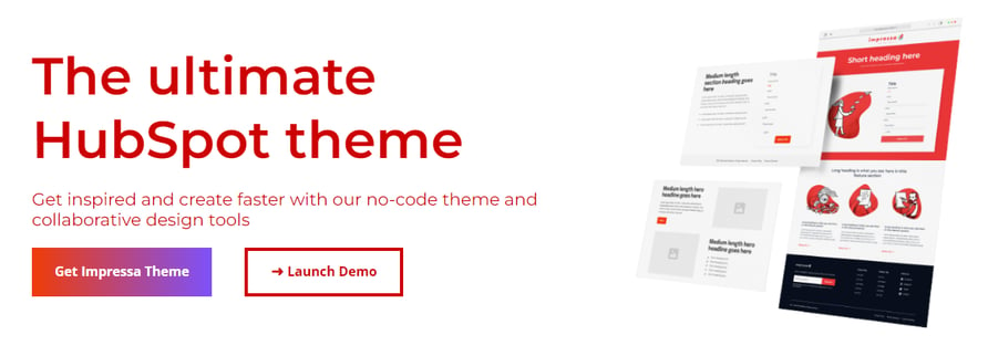
The fixed hero module is a module with two columns that’s main purpose is to force images to be displayed first in mobile breakpoints as well as be displayed in the first section of a website page. However, there is also two buttons( One that is a gradient button, the other that is a transparent button with a colored border and text), etc. WARNING: THIS MODULE AUTOMATICALLY USES THE LIGHT TEXT COLOR, AS IT IS MEANT TO HAVE A DARKER COLOR BACKGROUND. See below how you can change the rich text and button color. Customizable content is limited to the following.
Content –
- Rich text is a rich text field that can be changed with any headings, links, etc.
- Image that can be removed or replaced. Allows for addition of alt text, changing size to be automatically adjusted (recommended) or exact height/width
- Button
- Ability to delete the button
- Text in the button
- Color of text of button
- Link for the button.
- Button 2
- Ability to delete the button
- Text in the button
- Color of text of button as well as color of border
- Link for the button
- Custom bullet allows that lists in Rich text can have a image as the bullet point.
Style –
- Gradient allows you to change the colors and direction of the gradient background for the first button
- Rich text color allows you to change the color of the rich text.
Fixed Hero 2
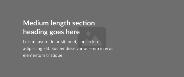
The fixed hero module is a module with one column with the width of half of the page, and the main purpose is be displayed in the first section of a website page. WARNING: THIS MODULE AUTOMATICALLY USES THE LIGHT TEXT COLOR FOR THE RICH TEXT, AS IT IS MEANT TO HAVE A DARKER COLOR BACKGROUND. See below how you can change the rich text color. Customizable content is limited to the following.
Content –
- Rich text is a rich text field that can be changed with any headings, links, etc.
- Button
- Text in the button
- Color of text of button
- Link for the button.
- Custom bullet allows that lists in Rich text can have a image as the bullet point.
Style –
- Rich text color allows you to change the color of the rich text.
- Button Color changes the color of the button and the border
Form
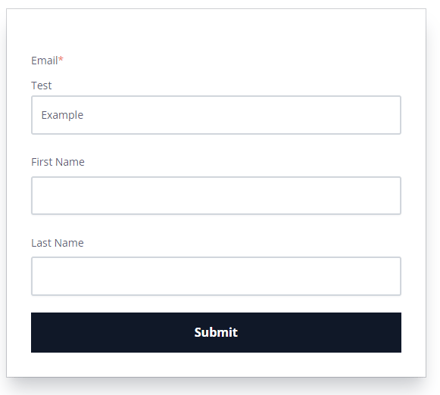
The Form Module is a module that takes all of the styling from the forms themes settings. Button is also displayed to fit the full width of the form, and the form has a shadow background. Customizable content is limited to the following.
Content:
- You can choose a form and choose the normal form settings, including content and thank you settings
Styles:
- Background Color
- Button Color
- Text Color
- Box Shadow
- Horizontal Shadow Offset
- Vertical Shadow Offset
- Blur
- Shadow size
- Shadow color
It is recommended that you keep the inherited colors in most situations (excluding the box shadow). However, if you want to create a form that needs to differentiate from the majority, feel free to change the button and text color. Just make sure that it follows proper contrast ratios.
Full Height IMG – Button
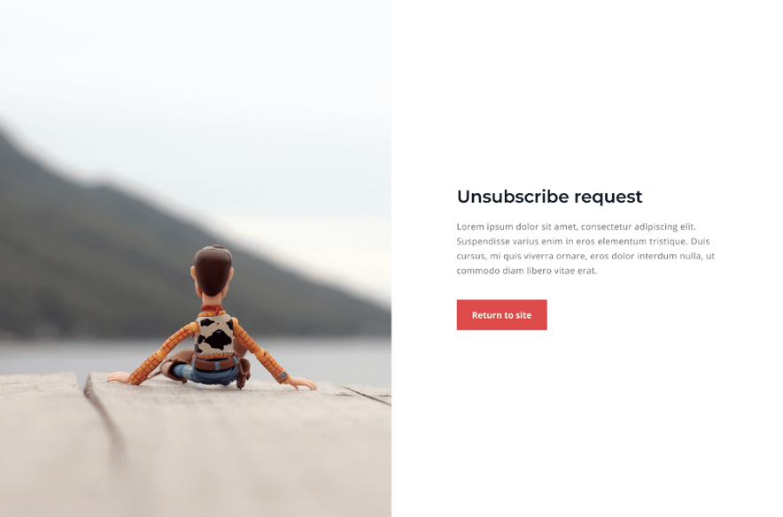
The fixed columns module is a module with two columns that’s main purpose is to allow the image to have a height that stretches to the size of the users device height. In mobile view, the image fills the entire background of the section, and transparency is added so that you can view the text better. Customizable content is limited to the following.
Content –
- Image that can be removed or replaced. Allows for addition of alt text, changing size to be automatically adjusted (recommended) or exact height/width, and image loading settings.
- Rich text is a rich text field that can be changed with any headings, links, etc.
- CTA that can be replaced with any HubSpot created CTA
Style –
- You can hide at desktop or mobile breakpoints, but this isn’t recommended.
Full Height IMG – Form
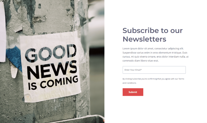
The fixed columns module is a module with two columns that’s main purpose is to allow the image to have a height that stretches to the size of the users device height. In mobile view, the image fills the entire background of the section, and transparency is added so that you can view the text better. Customizable content is limited to the following.
Content –
- Image that can be removed or replaced. Allows for addition of alt text, changing size to be automatically adjusted (recommended) or exact height/width, and image loading settings.
- Rich text is a rich text field that can be changed with any headings, links, etc.
- Form that can be replaced with any HubSpot created Form
Style –
- You can hide at desktop or mobile breakpoints, but this isn’t recommended.
Gradient Button

The Button Module is a module that takes all of the styling from the buttons themes settings, but the background is a gradient instead of a singular color. Customizable content is limited to the following.
Content:
- Text in the button
- Color of text in the button
- The alignment of the button – only applies to breakpoints with width larger than 767px (unless you turn off mobile center setting)
- Link for the button.
- Turn off the styling that puts the button in the center of the section at mobile breakpoints.
Styling:
- Gradient allows you to change the colors and direction of the gradient background for the button
Feel free to change the button and text color. Just make sure that it follows proper contrast ratios.
Menu
![]()
The Menu Module is a module that allows you to connect a menu created in your Hubspot settings, and display it on the page. WARNING: THIS MODULE AUTOMATICALLY USES THE LIGHT TEXT COLOR, AS IT IS MEANT TO HAVE A DARKER COLOR BACKGROUND. However, if you don’t have a dark background color, just use the primary text color instead. You can do this in the styles tab. Customizable content is limited to the following.
Content:
- Edit or create a new menu with a max number of levels
Styling:
- Text allows you to change the text color of the menu links
- Dropdowns
- Text allows you to change the text color of the links in the dropdown.
- Background allows you to change the background color of the dropdowns
- Border allows you to change the border style of the border around the dropdown. If chosen, you can change the color, and width as well.
Secondary Cards

The cards module is a module that holds a max of four cards. WARNING: THIS MODULE AUTOMATICALLY USES THE LIGHT TEXT COLOR, AS IT IS MEANT TO HAVE A DARKER COLOR BACKGROUND. Use the Card module if you would rather the cards have primary text color.
Cards are used to display information that should essentially point the user to other content, like a content offer, landing page, blog post, etc. Hence why there is a button CTA instead of a normal button. All aspects can be applied or removed based on preference. Customizable content is limited to the following.
Content –
- Cards – Can be removed or added. Max 4, Minimum 1.
- Click +Add to add a new card.
- To delete, hover over a card, and click the Delete Icon ![]()
- To edit the content of a card, hover over the card and click the Edit Icon ![]()
- Image that can be removed or replaced. Allows for addition of alt text, changing size to be automatically adjusted (recommended) or exact height/width, and image loading settings.
- Rich Text
- CTA that can be replaced or removed to link to the proper content location.
Styles –
- Card
- Background of each individual card can be a color, an gradient, or an image.
- Border can be applied with a style, color, and width
- Corner applies a curve to the corners of the card
- Spacing can add a margin above, and below the card. Padding can be applied to the card itself.
Social
![]()
The Social Module is a module that allows you to connect a plethora of social media links with their associated icons. You can add as many as you need, as well as include the name of the social media to the right of the icon. Customizable content is limited to the following.
Content:
- Social links– Can be removed or added. No maximum, Minimum 1.
- Click +Add to add a new social media icon
- To delete, hover over social media option, and click the Delete Icon ![]()
- To edit the content of a social media option, hover over the option and click the Edit Icon ![]()
- In each social media option, you can change the type of social media account, to social account name, the link, and add the accessibility option of a title to display in case the icon doesn’t.
Styling:
- Fill allows you to change the color of the SVG icons
- Size allows you to change the size of the SVG icons
- Background allows you to change the background color of the circle that holds the icon.
- Corner allows you to add to remove the radius of the circle
- Spacing allows you to change the space between the icons, as well as the above/below margins and padding of the inside of the circle.
- Alignment allows you to align the entire module to the right, left, or center.
Social Rows
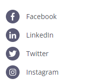
The Social Rows Module is the social module, but is displayed is rows rather than columns
Content:
- Social links– Can be removed or added. No maximum, Minimum 1.
- Click +Add to add a new social media icon
- To delete, hover over social media option, and click the Delete Icon ![]()
- To edit the content of a social media option, hover over the option and click the Edit Icon ![]()
- In each social media option, you can change the type of social media account, to social account name, the link, and add the accessibility option of a title to display in case the icon doesn’t.
Styling:
- Fill allows you to change the color of the SVG icons
- Size allows you to change the size of the SVG icons
- Background allows you to change the background color of the circle that holds the icon.
- Corner allows you to add to remove the radius of the circle
- Spacing allows you to change the space between the icons, as well as the above/below margins and padding of the inside of the circle.
- Alignment allows you to align the entire module to the right, left, or center.
Subscribe Form

The Subscribe Form Module is a module that is made only for forms that have a singular input, which should be an email input. It displays the button inside the email input, and email input stretches to the size of the container it is held in. This should already be created, if not, view this documentation.
Content:
- You can choose a form and choose the normal form settings, including content and thank you settings
Styles:
You can hide at desktop or mobile breakpoints, but this isn’t recommended
.png?width=400&height=135&name=648b5be5841e3e4acadd7ea6_darla-digital-logo-400px%20(1).png)
.jpg?height=230&name=Project%2099%20(5).jpg)
.jpg?height=230&name=Project%2099%20(3).jpg)
.jpg?height=230&name=Project%2099%20(1).jpg)
Want to make a comment?